Case study #1: Yakattack product catalog
The Problem
YakAttack needed a product an informative and aesthetically pleasing product catalog for both customers and dealers. Previous catalogs were created for dealers only and they were bare bones parts catalogs. They contained only one photo of each product and no photos of products in use. Our marketing team wanted to bring our brand to the 21st Century and create a photo-heavy catalog similar to Patagonia's catalogs. We also wanted to incorporate infographics and charts to better explain a product's use and relationship to other products.
previous dealer catalog
The Process
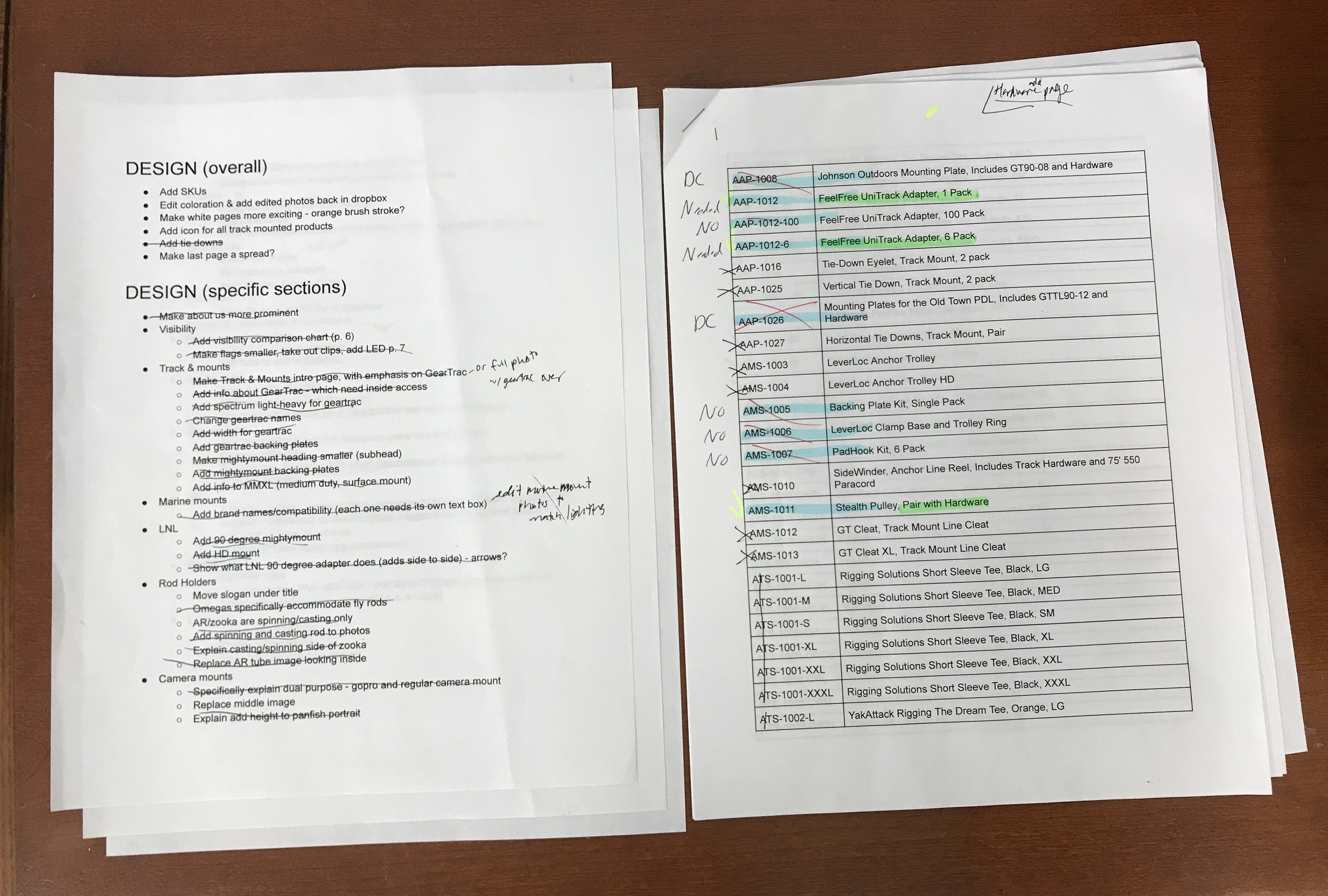
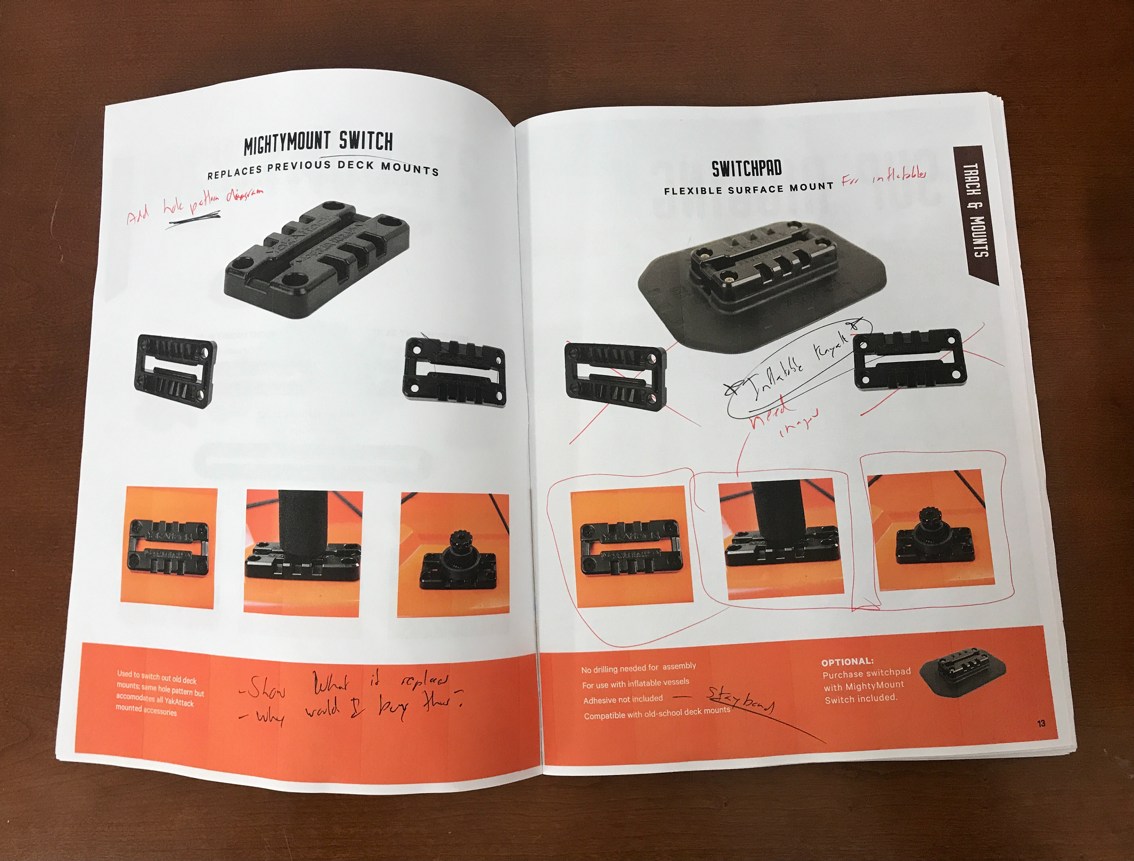
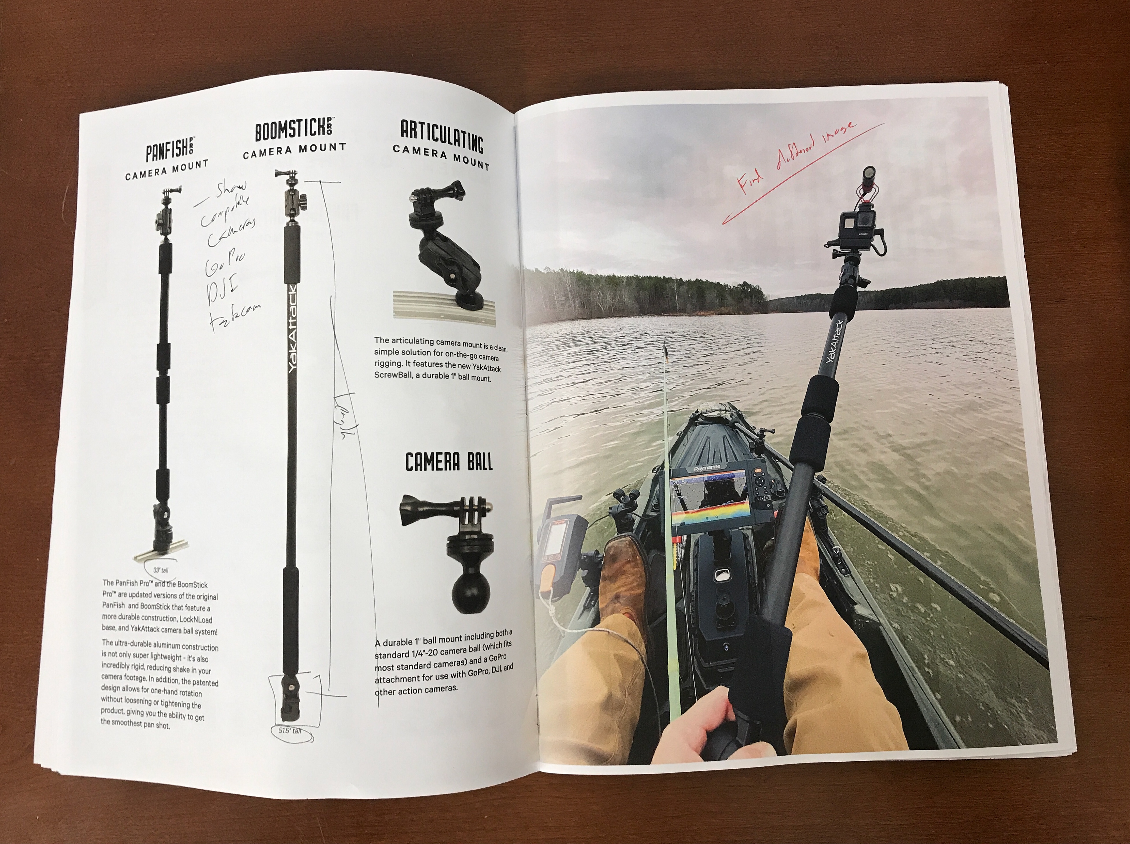
Our team spent weeks planning out the catalog, separating products into categories, and organizing photos. I was in charge of 100% of the design. My manager and I went on a photoshoot to capture images we were missing. I created the layout, which went through four rounds of revisions over five months.
The Solution
An 80-page product catalog packed with lifestyle photos and diagrams. I received positive feedback from coworkers, dealers, and customers. I stuck to YakAttack's branding while also introducing new graphic elements such as the orange brush stroke as a call-out and a brush font for the tagline "Make It Yours" to add excitement. Diagrams such as the GearTrac light-heavy duty spectrum and the Anchor Trolley anchoring system were carried into other applications such as the website and Amazon listings. This project moved YakAttack's branding to a whole new level.
View a selection of final catalog spreads below:
Front and Back Cover
GearTrac Spread
Visibility Spread #1
Visibility Spread #2
Anchor Trolley Spread
CommandStand Spread
__________________________________
case study #2: youth publications
The Problem
The Coffee Oasis is an organization that exists to change the world for homeless youth. We serve 13–25 year olds who are often told they don't belong or are not wanted.
"A Voice" is a quarterly youth zine (mini magazine) that seeks to give our youth a voice in the community; it provided an outlet for their creativity and allowed others to hear who these youth really are. The zine was created over 10 years ago and was stopped shortly after. The fellowship team was tasked with rebranding and relaunching "A Voice".
The Process
Along with the fellowship team, I taught art and writing classes in the Oasis Youth Centers in order to generate submissions. Youth were encouraged to submit art, photography, stories, poems, interviews, or any other creative expressions that fit the zine's theme.
Zine class at the Poulsbo Oasis Center
The Solution
I took these submissions and compiled them into printed booklets and online publications. I then created blog posts on the Coffee Oasis website to present each publication. I also created the logo and branding for "A Voice".
Both publications were distributed to each Coffee Oasis cafe, and were distributed to many businesses and medical offices throughout Kitsap County. This enabled the community to see and hear from the youth like never before.
Vol. 01: HOMETOWN
Flip through the online version:
Café zine display
